Order the Swatch First: The Cheapest Mistake You Never Make
A rug or curtain chosen from a screen arrives a different colour under your light, on your floor, next to your sofa.
The Calm Finds editorial desk · Published Sep 28, 2026 · Updated Oct 8, 2026 · 6 min
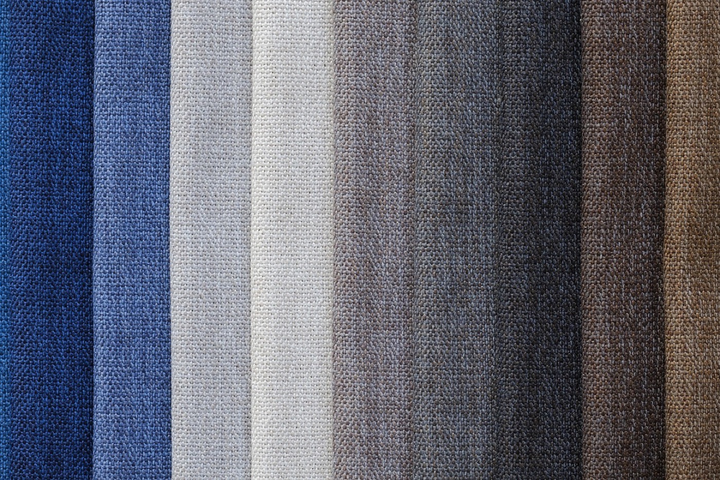
The swatch is the least glamorous product in soft furnishings and the only one that reliably prevents returns. A five-to-fifteen-dollar sample answers questions that no photograph, spec sheet or review can, because the failure it prevents is not about quality. It is about context: the same rug is three different objects under three different lights, and your room is the only one that counts.
What a screen cannot show
Colour rendering is the visible half. Screens differ from each other, and all of them differ from daylight, which is why the grey that looked cool online can arrive taupe. Retail photography adds its own bias: product shots are lit to lift the fibre, and a rug photographed in raking light shows a texture and depth that flat room lighting will not reproduce.
The invisible half is surroundings. Fabric colour is not absolute; it reads against what borders it. A charcoal curtain against a white wall reads crisp; the same curtain against warm wood reads almost black. A green rug on oak floor picks up warmth it never had in the photograph. These interactions are physical, local, and impossible to preview any way except in the room.
Then there is scale and texture. A hand-feel cannot transmit through a screen, and neither can the difference between a 12 mm and an 18 mm pile, which the height discussion in pile height explained shows matters as much as colour.
The swatch routine
Ordering swatches is the easy part; using them well is a sequence.
Order the honest shortlist: three to five candidates, not one, so the comparison has a field. Most makers and major retailers run swatch programs at nominal cost, and several credit the fee against the full order; the fee is the cheapest insurance in the purchase either way.
Put each swatch in position, not on the kitchen counter. The rug swatch lies on the actual floor where the rug will live. The curtain swatch hangs against the actual window, or at least in the window’s light path. Position is where the colour information lives.
Give it the day cycle. Morning light, midday, the west-sun hour, and evening with lamps on are four different tests. A fabric that passes three and fails one has told you something real, and if that one is the hour you sit in the room, it decides.
Run the physical tests while it sits there. Water on the pile shows how a spill will behave before you own the consequence; the shedding check, a brisk rub with a palm, pre-answers the questions in wool rug shedding explained; and a bend shows whether the backing is the flexible or brittle kind.
The neighbour test
The test most people skip is the one that catches the most regret: hold the swatch against what already lives in the room. The sofa textile, the floor, the wall colour, the adjacent rug, and in open-plan spaces the furniture two zones over, because sightlines make them neighbours too.
This is where the difference between matching and coordinating gets decided, and it is a judgement that needs the physical sample. A wool rug swatch beside a wool sofa can either sing or disappear, and both are possible outcomes of the same hex code. The material-level context, why wool behaves beside wool differently than beside synthetics, is covered in wool versus synthetic rugs.
One trick earns its keep here: photograph the swatch in position with the room’s actual lighting, then look at the photo tomorrow. The camera’s indifference strips some of the showroom romance and shows the palette as a flat fact.
What swatches cannot tell you
Honest limits keep the method in perspective. A swatch is a corner of a rug, not its layout; a medallion pattern reads completely differently at full size, which is why the room-measurement routine and a tape on the floor with painter’s tape stay part of the process. A swatch cannot show drape on a curtain, since fullness and weight create the folds, and that arithmetic is covered in curtain width and fullness. And it cannot show how a material ages, which is where the material deep-dives on this site carry the load.
None of that weakens the core claim. The expensive mistakes in soft furnishings are almost never construction failures, because construction is documented and reviewable. They are context failures, colour, light, neighbours, and context is the one thing a swatch delivers that nothing else can.
The habit, stated once: no order above the trivial goes in without a sample having spent at least a night in its future home. The few dollars and the few days are the difference between a room that was designed and a room that arrived.
Frequently asked
- Why does a rug look different at home than online?
- Three stacked causes. Screens render colour differently from each other and from daylight; a retail photograph is lit to flatter the product; and the colour you see at home is the fabric under your bulbs and against your walls, which is a different environment from both. A pale grey wool reads warm beside oak floors and cold against white walls, and no product page can show that.
- How long should I live with a swatch before deciding?
- At least a full day and ideally several, in position: the swatch on the actual floor, the curtain fabric against the actual window. You want to see it in morning light, afternoon sun and evening lamps, because those are three different fabrics. A swatch judged in one light for five minutes catches about half the surprises.
- What tests are worth doing on a swatch itself?
- Four, all small. Drop a teaspoon of water on it and time how it sits; check whether the pile sheds when rubbed briskly; bend it to feel backing stiffness; and hold it against the two or three textiles it will live beside. On curtains, fold it to approximate its fullness and look at it against the glass. Together they catch the failures colour alone cannot.